

A platform for Matching Energy Projects And Financiers.
We won a bid to design and develop a Green Fund match-making web app on behalf of the South African German Chamber of Commerce. The project goal was to increase renewable energy partnerships between Project Owners and Financiers in southern Africa. Our brief included Project Management, UX Design, UI Design, and Prototyping.
The process of acquiring funding for Project Owners (PO’s) and the Identification of suitable projects to fund for the Financial Institutions (FI’s) in developing countries is made difficult by a lack of data. PO’s and FI’s do not have an aid that can match their goals with a suitable partner.
An intuitive Green Funding platform that facilitates match-making opportunities between late-development projects and high intent funders.
Whimsical
Figma
AWS
Project Manager
UX Designer
UI Designer
Copywriter
UX design
UX research
Brand Strategy
UI Design
Prototyping
Workshop facilitation
Project Management
Overall: 10+ weeks
Discovery & Research: 4+ weeks
Design & testing: 6 weeks
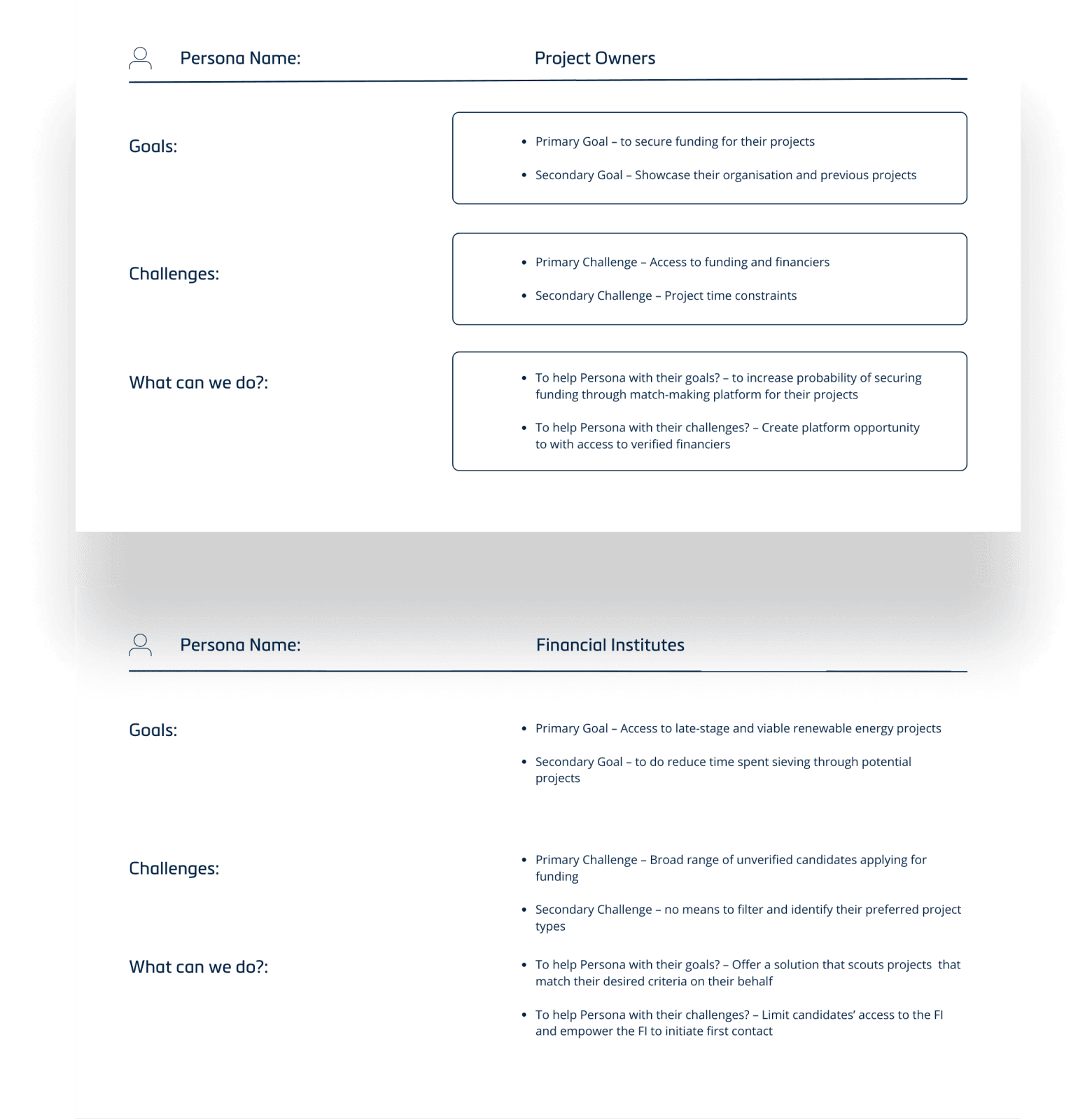
To build a match-making platform we needed to have a good understanding of our different user segments. We created personas to define the goals, needs, and experiences of renewable energy Project Owners and of Financial Institutions. The personas were based on detailed market research and data gathered through interviews during development of the MEPAF business plan by the client. We updated the personas throughout the project as we gathered more data and checked against them to keep the design aligned with the user goals.
We established that the Developers’ primary goal was to secure funding for their projects and their greatest challenge was improving their visibility, and the probability of winning funding.
Financiers wanted access to late-stage and viable renewable products but struggled with the challenge of time spent manually sieving through potential projects.
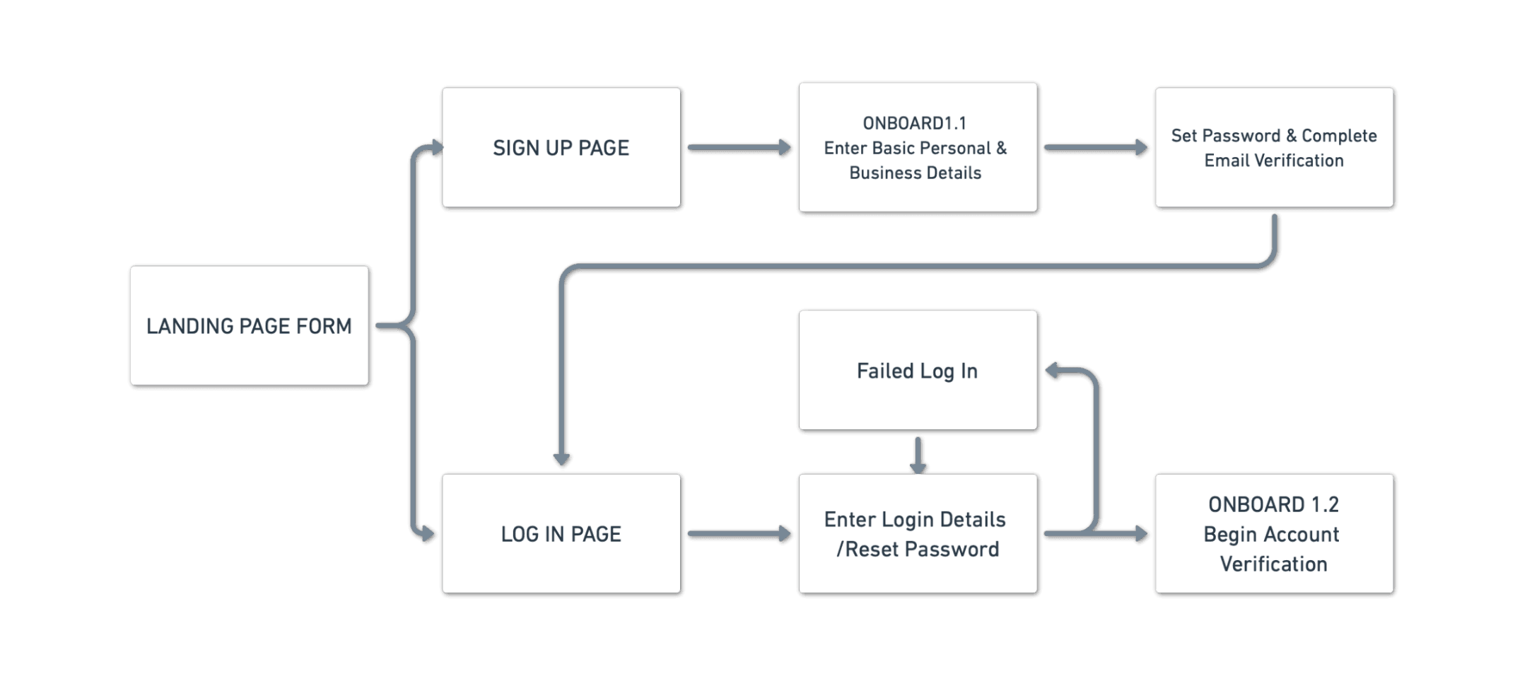
With trust and engagement in mind, we had to ensure accurate verification of user credentials while enabling users to begin finding matches as soon as possible. So, we developed user journey maps for the PO’s and FI’s, to identify opportunities for improvement. We identified that the onboarding flow required to achieve 100% verification for both user types was too long and had several potential drop-off points.
By distributing groups of data from the onboarding flow across to the registration, personal profile and business profile data input flows, I managed to segment the verification process into bites sizes. This allowed users to feel like they accomplished tasks faster and were able to move on to searching for a business match quicker.
We began the design process with low-fidelity sketches to brainstorm. Our goal was to find a layout that simplified the many task flows and encouraged engagement. We based the sketches on the product requirement document and the user personas. The design we settled on was a cross between a traditional dating website and a job market app.
For the PO’s, we sketched dashboards and project pages inspired by job market and e-commerce product pages.
For FI’s we designed a dashboard with familiar controls from dating and social media apps for discovering new matches.
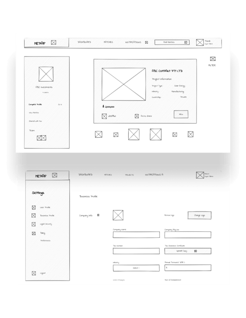
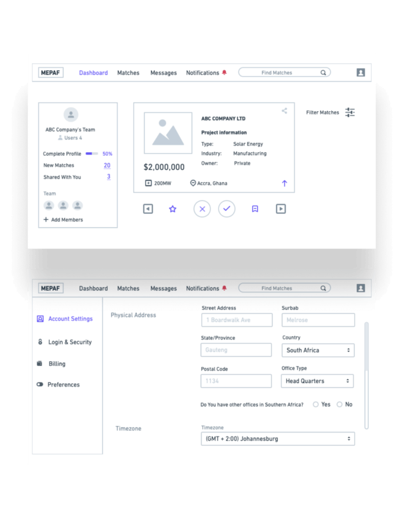
Using Whimsical, we developed my initial sketches into low-fidelity wireframes for presenting to the design concept to the client. Our designers added a bit of copy from our content strategists to improve the design. The wireframes were now also defined enough for some user testing. Based on client feedback and 3 tests, we made a few alternations and moved on to creating high-fidelity prototypes.
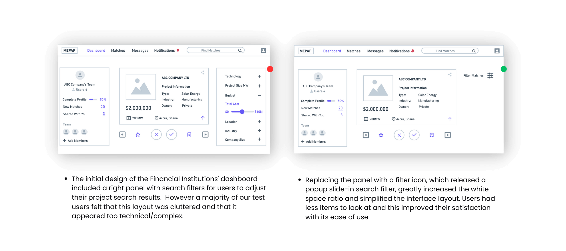
The test users preferred a closed search filter for the Financial Institutions dashboard so we added a hamburger filter button and converted the filter panel into a slide-in popup.
We created high-fidelity prototype of both the new PO and FI flows to help the developers visualise the end product and accelerate front-end development. At the same time, we started testing the system functionality and usability as a team before we could invite our suitable focus group. We did 5 usability tests in the first round between us and 2 after iterating on the issues that we’ve identified:
No data archive for exiting team members
A major issue we found for both the Project Owner and the Financial Institution teams was that we had not accounted for what would happen to the data from all matches belonging to a team member if they left the platform?
New automated data transfer flow to super admin
We designed a new workflow that would automatically alert the super admin when an exiting team member’s matches and data required re-assignment. The super admin would have the option to assign the archived data to themself or to another team member under the same company profile.
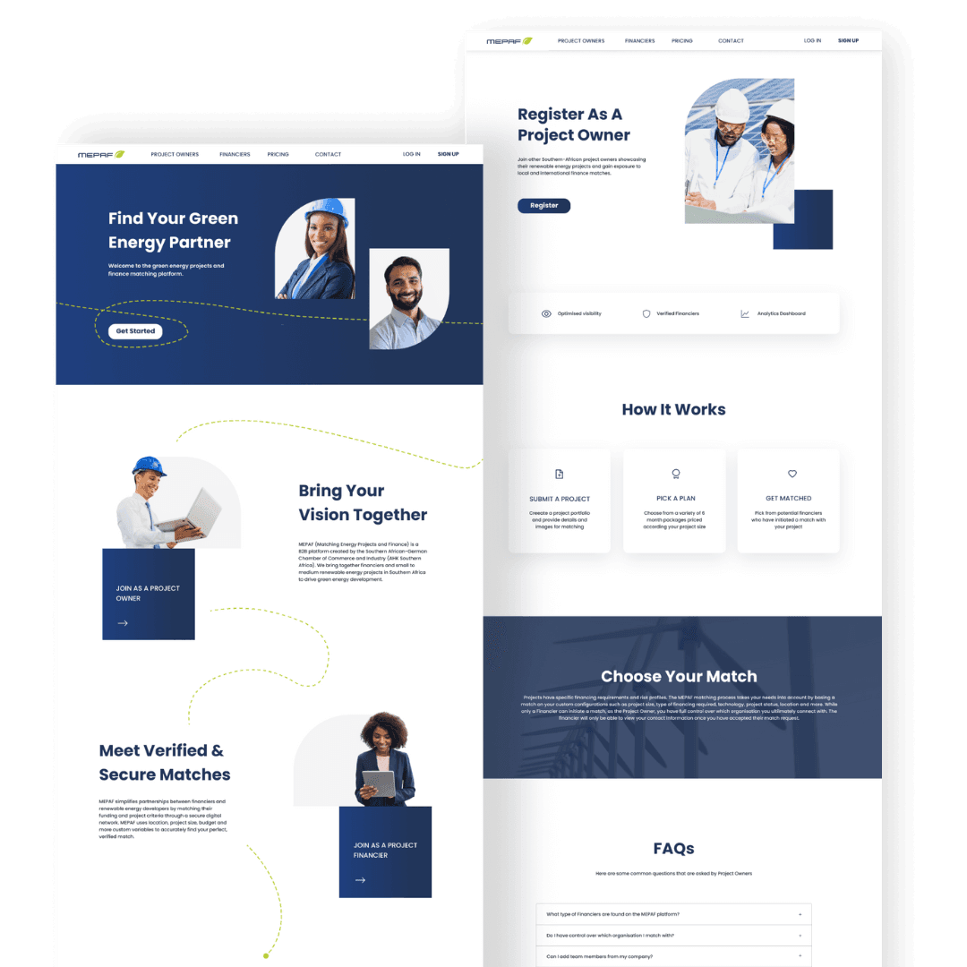
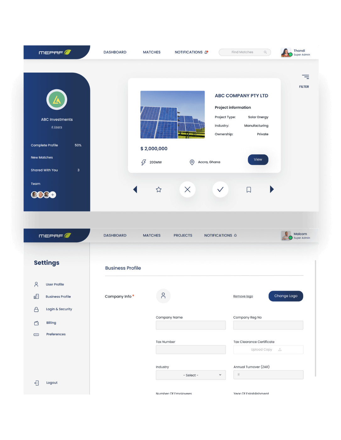
We designed the final screens and instances in Figma. Our brief was to create a visual identity for MEPAF that aligned with the SA German Chamber of Commerce’s values and brand guidelines. We referred back to the user personas and business goals to develop visual style that was professional, futuristic and invoked trust.
MEPAF was designed primarily as web app for desktop.
As the platform was designed for project developers and financiers, the tone and feel of the visual design that we chose was corporate and professional.
Dashboards and tools for modern business use.
Digital training that’s engaging and measurable.
Websites that communicate clearly and perform fast.
Helping brands engage customers through chat.
Social and email campaigns that drive real results.
Visuals that keep brands clear and consistent.